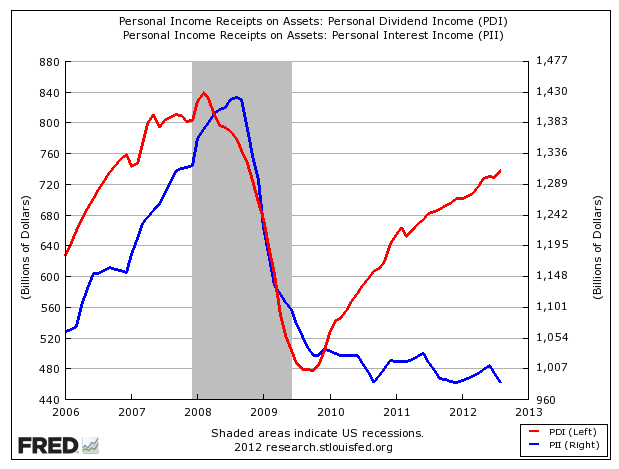
Here is one chart that helps to explain the critical advantage of stocks over bonds over the past few years – it even appeals to a noted stock market skeptic:
 Sources: Business Insider, St. Louis Fed
This shows total personal dividend income (in red) versus personal interest income (in blue), based on all U.S. personal income receipts on assets. As part of his coverage of last week’s The Big Picture conference, Joe Wiesenthal created the chart.
Since 2010, the chart shows a dramatic increase in personal dividend income relative to interest income. It’s a function of a rising stock market, higher dividend payments and declining bond yields over that timeframe. Interest-based income remains paltry, and dividend-paying stocks have provided one way to potentially make up that shortfall.
Will dividend income continue to have an advantage over interest income?
Economist and strategist David Rosenberg, a noted market and economic bear who prefers bonds investments to stocks, was one of the heavyweights to speak at The Big Picture. He sees an eventual rise in interest rates coming, and is bearish on the economy.
Yet he said that one of the best arguments for stocks right now is that S&P 500 dividend yields near 2% are still above a 5-year T-note yield that remains below 0.7%.
In effect, the Fed is “forcing” investors into equities through quantitative easing that keeps rates so low, he says. They simply offer the superior payout.
Rosenberg still sees many threats to the ongoing economic recovery. Even still, he still can see a case for buying stocks for their dividends. Here’s Rosenberg’s investment strategy in a single slide and his full presentation.


