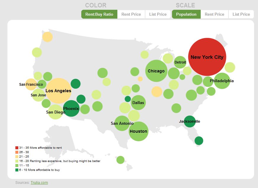
A common rule of thumb is that it’s better to rent a home when the cost of buying is at least 20 times higher, and it’s smarter to buy when that ratio falls to 15 or lower. Real estate search company Trulia drew upon its wealth of data to produce this helpful interactive graphic on whether, according to this rule, it’s currently better to rent or buy in America’s 50 largest cities by population. Red cities are more affordable to rent, and green are more affordable to buy. Click through to try it:
A second graphic layers on economic data for each city, so you can see the interesting relationship between the rent:buy ratio and factors like unemployment, foreclosures and job growth. Trulia’s press release takes a stab at explaining those results:
Cities overwhelmed by foreclosure filings and unemployment, including many cities in Florida, Arizona, Nevada and central California, typically correspond to more affordable markets for prospective buyers; however, there are exceptions. Oakland and Los Angeles, which are experiencing similar rates of unemployment or foreclosure filings as Phoenix, Miami and Sacramento, are still more affordable to renters. Moreover, close proximity to economic centers with promising job growth projections has propped up both the demand for homes and costs of home homeownership in Oakland and Los Angeles.
For a customized version where you can plug in your own numbers, use the New York Times’ outstanding buy-rent calculator.


