by Michael Tarsala, CMT
Is it too late to get in on the stock rally?
I seem to be getting that question a lot lately. As usual, I like to answer questions with chart-based observances.
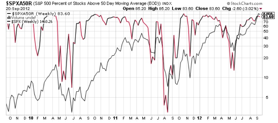
I’ll start with a chart that you might have seen — it’s now making the rounds — that attempts to answer the question.
Source: Stockcharts.com
In black is the S&P 500, and is red and black is the percentage of S&P 500 stocks now trading above their 50-day moving averages. Nearly 84% of stocks on the benchmark index are now trading above their 50-days. The last time that happened was late January. The percentage slowly rolled over from there, seemingly a precursor to the market’s decline in May.
Don’t let that throw you, though: The indicator is hardly foolproof. In fact, you can also see that it provided many false signals in the past two years. It essentially remained very high from September 2010 through May 2011 while the markets continued to rally. So I find it hard to prescribe a lot of predictive power to it.
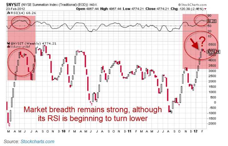
Here’s a different perspective based on the way I like to analyze price trends over the long-term. I’ll start with the chart that tipped me off back in February that the stock rally was starting to become a bit overheated:
Source: Covestor.com
The black and red line above is the McClellan Summation Index, and it’s one of the tools I rely upon most to gauge the health of a market uptrend. It is a breadth measure derived from the ratio of advancing to declining stocks in the market. It’s built to track the long-term direction and power of the trend.
If you would like to more about it, the best place to learn is right from the McClellan site.
Like any oscillator, the McClellan Summation Index has a “neutral” line. In this case, readings above +1000 are considered positive, and less than +1000 is considered negative. A breakdown from an extremely positive condition typically warns of coming market downside. A breakout to the upside from an extremely negative condition, on the other hand, warns of market upside potential.
What we saw back in February was very strong market breadth that was starting to turn to the downside again. It was pointing to a gradual, but meaningful shift in the number of advancing stocks relative to declining stocks in the market. It was not an immediate sell signal, mind you. It was an early warning sign that there was a transition taking place ahead of the May selloff.
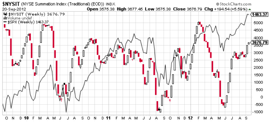
Here’s what that same chart looks like now (I also superimposed the S&P 500 in this one).
Source: Stockcharts.com
You’ll notice that the Summation Index continues to move higher out of a narrow sideways range in July and August. It bears watching going forward, as it always does. But there is neither resistance nor a negative development in the index. For example, we do not see a series of lower highs in the index that tipped us off to weakness in early 2011. Instead, we see a positive index that is still chugging along.
That’s a positive sign. The early warning signal hasn’t even triggered yet.
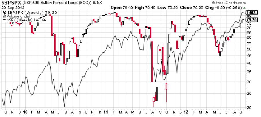
Here is one more indicator that I like to use to help gauge longer-term trends:
Source: Stockcharts.com
The line in red is the Bullish Percent Index, or BPI. It tracks the total number of stocks in a given index that are showing buy signals based on the Point & Figure style of charting. In black is the S&P 500.
Point and Figure breaks down market moves by a set percentage into a series of Xs (positive signals) and Os (negative signals). Some market technicians believe in Point and Figure as a way to generate clean buy or sell signals based on price action.
Stockcharts.com has an excellent tutorial on Point and Figure, as well as a separate one just for BPI.
What the BPI is reflecting is that 79% of S&P 500 stocks now a Point and Figure “buy”. You will also notice that a declining BPI line did a very good job of giving an early warning signal to the May decline this year, as well as the summer swoon in 2011.
What you do NOT see at the far right edge of the chart, however, is a slow rollover in the BPI line that could give the early warning signal to a price reversal. That simply hasn’t happened yet.
It’s always wise to be cautious. Yet at this point, these two technical signals are still pointing to an upside market trend with few reasons to think that stocks are overbought.
Disclosure: Certain of the information contained in this presentation is based upon forward-looking statements, information and opinions, including descriptions of anticipated market changes and expectations of future activity. Covestor believes that such statements, information, and opinions are based upon reasonable estimates and assumptions. However, forward-looking statements, information and opinions are inherently uncertain and actual events or results may differ materially from those reflected in the forward-looking statements. Therefore, undue reliance should not be placed on such forward-looking statements, information and opinions.


