By Michael Tarsala
You can’t expect to define a primary market trend without breadth. It’s arguably the REAL “big mo.”
The good news for bulls: Baird suggests that 95% of global markets are in defined uptrends. We have not seen this kind of strong breadth since the rally off the March 2009 bottom. And check out the latest from Bespoke: The ratio of advancing to declining stocks for eight of the 10 major market sectors is at or near their peaks since the bull began nearly three years ago.
The weak links are utilities and telecom, which are arguably very different stock investments altogether. Both had been favored in recent years by cautious investors seeking low-risk equities with high dividend yields.
The breadth research paints a far more bullish picture than it did at the end of 2011. Looking ahead, will this underlying strength continue? Here is an important indicator to watch:

Source: Stockcharts.com
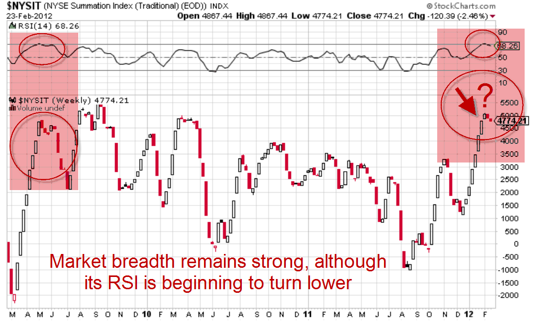
This is the McClellan Summation Index. It adjusts for the fact that a few stocks may be driving the overall market higher. In doing so, it’s one of the best measures of the underlying strength of long-term stock market trends, according to technical analysts.
Look closely at the Relative Strength Index at the top of the chart, and you’ll see that it’s beginning to turn lower from a reading near 70%. That last happened back in May 2009 (highlighted to the left).
But a weakening of the long-term breadth indicator did not spell the end of the 2009 market rally. Stocks went on to rise more than 20% to the April 2010 highs, and more than 30% to the 2011 peak from when the McClellan Summation Index began to dip.
The upshot: Market breadth suggests the underlying trend could still be to the upside. And in the last rally, that underlying trend didn’t turn lower on a dime when the breadth began to wane.


