One of the most widely watched market breadth indicators is providing a healthy sign for the ongoing U.S. stock market rally.
You’ll hear market analysts on TV talk about breadth from time to time. There are many different ways to measure it, but all of them attempt to gauge the number of stocks that are taking part in a market move higher or lower. A trend with a lot of breadth is considered to be a lot more reliable than a trend without it.
Studying breadth can also help identify market turning points. Breadth that is moving in the opposite direction of a stock market trend can sometimes come ahead of a change in price direction.
The number of stocks making new highs and/or new lows is among the most popular breadth measures. One of the most common ways that this information is analyzed is with the Advance-Decline line (or the AD Line). It provides a running tally of the net number of stocks advancing on a daily basis. Stockcharts.com has a concise explanation of the AD Line, including its calculation.
Source: Stockcharts.com
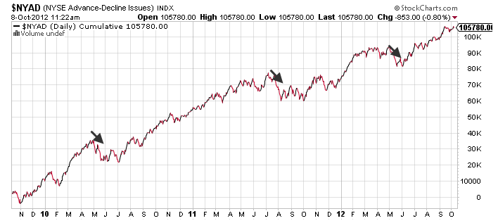
Above is a three-year look at the market’s AD Line. It has moved up and to the right for the most part, with a few notable exceptions. It fell in May 2010, and then moved sideways for the next several months. There was a similar phenomenon in July 2011, and then a shorter-lived pullback in the advance-decline line in May 2012.
Source: Stockcharts.com
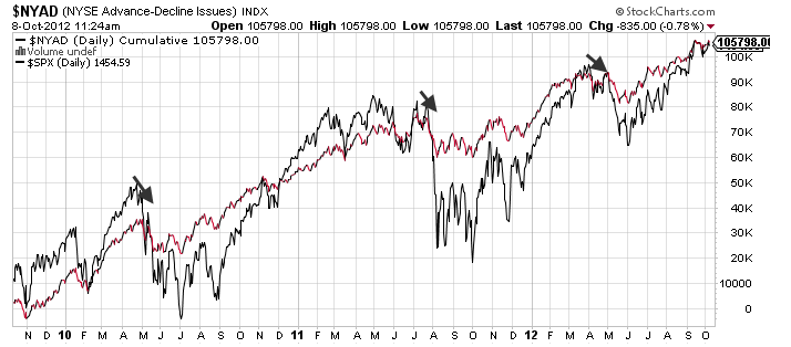
Here you see the same AD Line, with the S&P 500 superimposed in black. The three meaningful declines in the AD Line coincided with the past three market pullbacks of significance.
More important, however, were the times when the AD Line helped to confirm the market’s advance. Take September 2010 as an example. The market’s direction was seemingly in doubt. One factor that helped signal an advance, though, was the rising AD Line. It dipped in September of that year, but held its upward trendline.
Also of note was the sideways movement in the AD Line early this year. Stocks were moving to new highs, although the lackluster breadth helped to provide an early signal ahead of the May selloff.
Source: Stockcharts.com
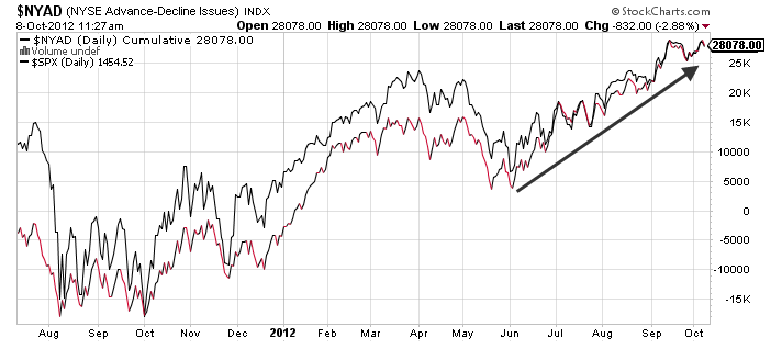
What’s going on now? Here you see the A/D Line in red and black, and the S&P 500 in black; it’s in a slightly shorter timeframe so you can see the most recent months in greater detail.
We are seeing a continued uptrend since the start of June with very few hiccups. What is encouraging about the market uptrend is that the AD Line is moving in lockstep with the markets. The number of net advancing stocks is still moving higher.
This is not a be-all, end-all measure. But it and other breadth metrics are showing few signs of weakness. They bear watching going forward. Yet at this point in the market cycle, they are suggesting that the ongoing rally has necessary breadth support.


