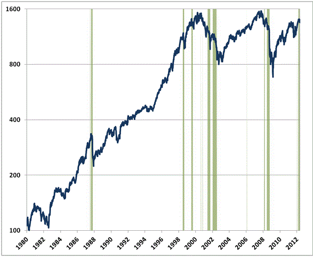
 In his recent weekly commentaries, mutual fund manager John Hussman has warned that current market internals – vis-a-vis its return/risk profile – are among the worst recorded on the historical record. In this week’s commentary, Hussman finds that over the past 7 days things have become even worse, and offers a chart to illustrate (emphasis added):
The green bands in the chart below depict all of the points since 1980 in the neighborhood of present conditions – having a nearly similar prospective return/risk profile, coupled with a particularly hostile “exhaustion syndrome” that has been a hallmark of the worst market outcomes in recent decades. The blue line shows the S&P 500 Index. As I noted in Goat Rodeo, “what this combination picks up is an already fragile set of market internals that has enjoyed an ‘exhaustion rally’ that both exceeds earnings growth and is met with overbullish sentiment.”
I usually show longer-term charts, but there are no green bands prior to 1987. Before that point, valuations were never been as extended as they are today – on the basis of normalized earnings – except in the quarters leading up to the 1929 crash. Exhaustion syndromes prior to 1987, while still very hostile to stocks, didn’t occur in valuation conditions as rich as we have today. It’s worth noting that there is a very narrow band in 2006 that was followed by a decline of only a few percent, but even the seemingly benign instances in 1998 and early 2000 represented losses exceeding 10%. I suspect we’re at risk of something far more significant.


