by Michael Tarsala, CMT
Here’s a handy method for checking out the health of a stock sector in which you are heavily invested — or the market as a whole for that matter.
There are lots of market tools at your disposal. And out of all the ones out there, breadth indicators are among the metrics I use most to try to gain long-term perspective.
They help identify the underlying strength of an overall market or group. They tell you when a group of stocks is starting to strengthen or weaken. And they are invaluable when you are trying to figure out what might happen next at market extremes.
Breadth, as you may know, simply looks at the number of stocks participating in an up, down or sideways move, rather than the magnitude of that move. Popular measures include the number of stocks advancing vs. declining, and the number of new highs vs. new lows. They are useful in gauging market sentiment — one of the technical measures that’s also commonly used by many fundamental analysts.
Back in February, we took a look at another classic breadth measure, the McClellan Summation Index, and how it was pointing to continued market strength.
What’s good about breadth is that it treats all stocks equally. It helps you avoid a skewed view of an index based on what might be happening with a handful of outliers.
Today we’ll focus on a different breadth metric, called the Bullish Percent Index — one that I find useful to help gauge trends in longer timeframes.
The Bullish Percent Index, or BPI, tracks the number of stocks in a given index that are showing buy signals based on the Point & Figure style of charting, which breaks down moves as a series of Xs and Os. Stockcharts.com has an excellent tutorial on Point and Figure. Go there to learn the basics!
A separate tutorial specifically on the Bullish Percent Index explains how you can use BPI to confirm trends and alert you to the potential for new trends.
You don’t have to look at the Xs and Os of point-and-figure chart to use BPI, though. It’s easy to apply the prefix $BP to regular bar or candle charts in Stockcharts.com to get the BPI for that index. Then you can simply read it as a percentage extreme, with readings above 70% showing overbought conditions, and BPI of 30% or less as being bullish.
Here’s a short list, by the way, of the indexes where you can apply the $BP prefix. I keep that very link in my browser favorites.
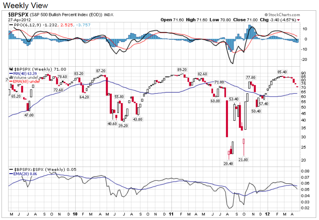
Let’s start with a look at the BPI for the S&P 500.

Source: Stockcharts.com
At a reading back below 70, it’s now worked off some of its overbought condition. Yet it’s still falling from that previously overbought level. This chart was most useful in early April, when it provided an early warning sign ahead of the April lows for the S&P 500.
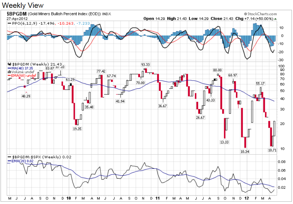
Here’s a BPI chart that may be saying something a bit more timely: Gold mining stocks.

Source: Stockcharts.com
This is a BPI chart of the gold miners. What you’ll see in the red-and-white candle chart is that the breadth of the group is now improving from an extremely oversold level. On it’s own, this is not a be-all, end-all signal. Yet it does point to a sector where a long-term investor might start doing some more homework on a group of stocks.


