
The performance of other big IPOs in the past is one of five things you need to weigh as you think about whether a Facebook investment is worth the risk.
Outlook
2601 posts
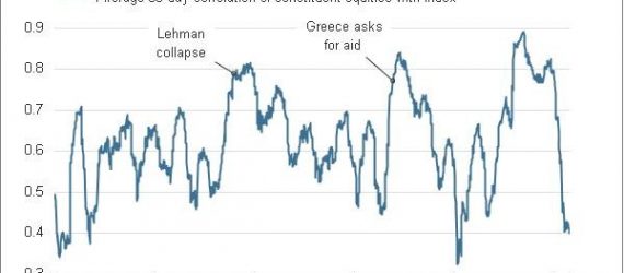
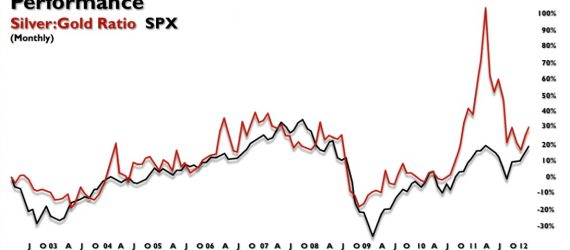
Scott Barber at Reuters always comes up great insightful charts, and his latest may be saying something fairly positive about the health of the stock rally.
Investors closed the month of February with their highest net long exposure in 14 months, according to Lipper data.

The combined size of world’s eight major central banks’ balance sheets has almost tripled in the last six years.
Regardless of income and education, a new study suggests that investors with higher IQs do these five things well.