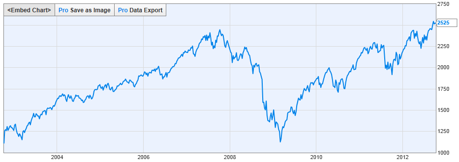
Here is the one chart that market strategist Jeffrey Saut at Raymond James believes could be leading the way to an all-time high for the S&P 500:
Source: YCharts.com
Above is the S&P 500 Total Return Index. It takes into account both the S&P 500 price action, as well as reinvested dividend payments. It is thought by some to be a more accurate representation of the index’s performance.
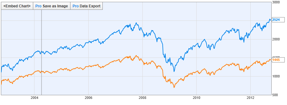
What you will notice is that unlike the S&P 500, the S&P 500 Total Return Index already has broken out to an all-time high, eclipsing its previous peak in 2007. It looks very different from the S&P 500 chart on its own (included in yellow below), which remains below its 2007 peak:
Source: Stockcharts.com
As Saut notes, some market watchers are eyeing the 2007 S&P 500 peak with trepidation, thinking that it represents major resistance that is unlikely to be crossed. As such, they argue that the market at this juncture has very little upside left.
Yet here’s what Saut had to say about that this week:
I don’t believe them, just like I didn’t believe them a few months ago. As scribed in this report two months ago, when many sages were talking about a double top referencing the March/April 2012 highs at 1422 basis the SPX, I noted that the S&P 500 Total Return Index (and many other indices) was already trading to new all-time highs and was pointing the way higher. That’s still the case. Further, trading volume is abysmal, suggesting portfolio managers are still too defensively positioned.
Earnings season, which officially gets underway this week, are expected to have a bearing on the rally’s continuation. Earnings simply cannot disappoint for the rally to continue, Saut says.
Yet he’s still thinks there is upside, and that any downside is likely to be contained by major support in the1,400 to 1,422 range on the S&P.


