by Michael Tarsala, CMT
Let’s look a little more closely at a scary-looking chart that’s making the rounds as Mark Faber and others start to warn more forcefully about overbought stock markets.
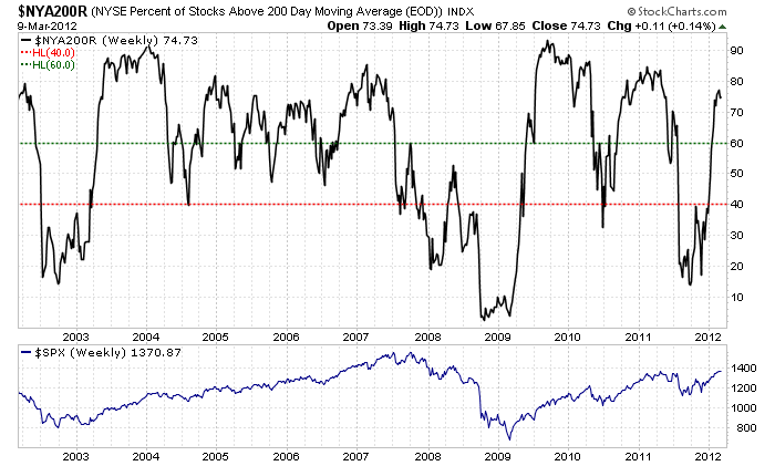
Fireside Charts puts this in great perspective. It’s a look at the percentage of stocks trading above their 200-day moving averages (read more for an in-depth analysis).

Source: Fireside Charts
One reflection of buyers’ fatigue is when most stocks are trading well above their 200-day averages, when that percentage starts to drop from a high level.
Without reading all the context in the Fireside analysis, this is a scary-looking chart! You can see that about 75% of U.S. stocks are trading above their 200-day moving averages right now, and that percentage is now just starting to tail off. For the last two years right around this time, we also saw a quick drop in the number of stocks trading above their 200-days. That was a precursor to big declines on both occasions!
But also consider this:
Rallies from extreme lows had staying power
The chart above shows there were three occasions when there were just 15% of stocks trading above their 200-day averages: in 2002, 2008, and in 2011.
Yet it also showed that the first two rallies still had staying power a year after 60% of the NYSE was back above their 200-day averages. I calculated that they went on to rise 34% from that point the first time around, and 42% the second time.
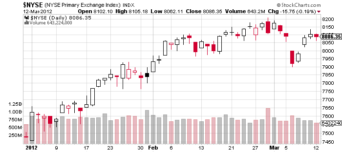
What about this time? It was early January 2012 when 60% of NYSE stocks reached their 200-day averages. The index has risen only about 8% since then.

Source: Stockcharts.com
That said, near-term weakness is still possible
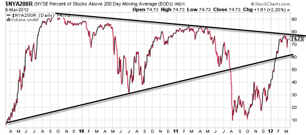
The drop in the number of stocks above their 200-day averages looks to be insignificant so far, at least for investors. It looks nothing like the giant drops in April 2010 and July 2011, for example.
Keep in mind, as Fireside points out, the real turning point to bearishness would be if there were 40% or fewer stocks on the NYSE above their 200-day averages.
Could the markets still become bearish in the near-term, within a continued rally? That is possible. Without making a projection, I would see it as a negative in the near-term if this chart below were to slip below cross-line support, which corresponds with about 60% of NYSE stocks above their 200-day averages.

Source: Stockcharts.com
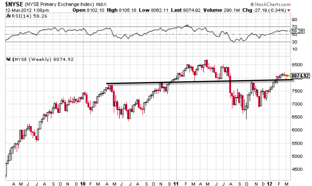
If that happened, it would likely correspond with a move below last week’s lows on the NYSE, which corresponds with another cross-trendline support level going back to April 2010.


