By Steve Sosnick, Chief Strategist at Interactive Brokers
Investors are well aware that markets have been boosted by stimulus. While fiscal stimulus has been a “will they or won’t they” affair since the initial blast that we saw in the spring (as of this writing, Congress is still negotiating a potential package), the Federal Reserve has been steadfast in supplying liquidity since March. In fact, the Fed has been doing their best to compensate for the lack of fiscal support, expanding its balance sheet at a rapid clip since a brief respite in June (we noted this in October).

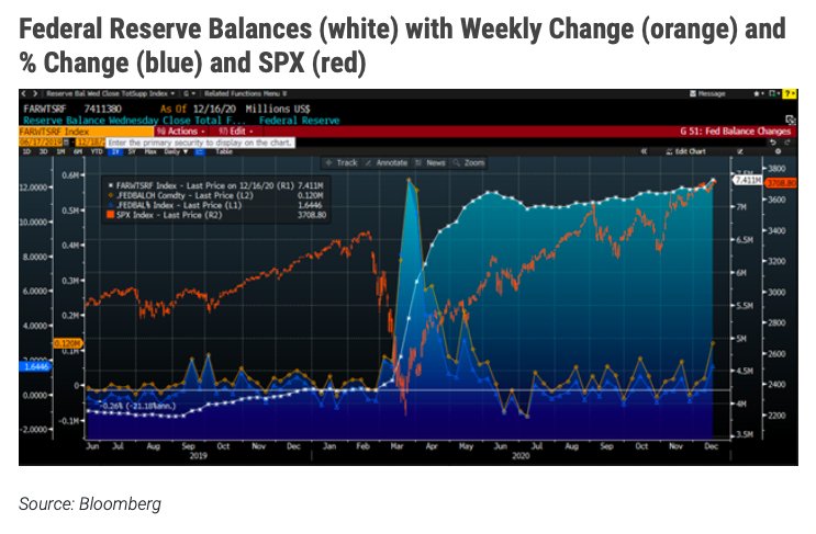
Every Thursday afternoon we check the Federal Reserve’s website for the latest statistical release about their balance sheet. Yesterday’s report showed the biggest single week jump in both absolute and percentage terms since May. We can see that in the orange and blue lines in the lower section of the graph below:

Source: Bloomberg
Note the slope of the white line that represents the size of the Fed’s balance sheet. Its rise is of course nowhere near as dramatic as the skyrocket trajectory that we saw from March through June, but it would be unrealistic to expect that sort of trend to continue. Instead, it is similar in slope to the growth of the balance sheet that we saw from September 2019 through January 2020. That was sufficient to propel equity markets to what were then record highs, just as it is apparently sufficient to do so once more.
Since the small dip that we saw in June and July, the balance sheet has grown by 5.97%. That may not sound like much, but that amounts to an annualized pace of 16.4%. That is exceptionally fast by any normal historical standard. It is quite clear that the Federal Reserve is expanding its balance sheet, and the result – intended or not – is boosting asset prices. Traders learn quickly that it can be very difficult and expensive to fight the Fed. In general, it has been quite unprofitable to do that.
Sharp-eyed readers will note that the changes have a pattern. They have peaks around mid-month, and yesterday’s bump fits that pattern. That may be the result of timing issues involving the maturities of some of the Treasury instruments that populate the Fed’s mix of assets. But traders know how to spot a trend. We see the classic pattern of mostly higher highs and stable or higher lows in the changes since August. Even if we see some reversal of this week’s bounce in the coming weeks – which could themselves be subject to some unusual holiday and year-end seasonality – the pace of expansion is clearly steady and rapid.
Photo Credit: 401(K) 2012 via Flickr Creative Commons
DISCLOSURE: INTERACTIVE BROKERS
The analysis in this material is provided for information only and is not and should not be construed as an offer to sell or the solicitation of an offer to buy any security. To the extent that this material discusses general market activity, industry or sector trends or other broad-based economic or political conditions, it should not be construed as research or investment advice. To the extent that it includes references to specific securities, commodities, currencies, or other instruments, those references do not constitute a recommendation by IBKR to buy, sell or hold such investments. This material does not and is not intended to take into account the particular financial conditions, investment objectives or requirements of individual customers. Before acting on this material, you should consider whether it is suitable for your particular circumstances and, as necessary, seek professional advice.


