by Michael Tarsala
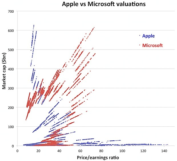
Ben Walsh and the data team at Thomson Reuters put together an amazing chart that puts Apple’s ascent to the most valuable company ever into some perspective.
It compares Apple’s product-driven rise to the throne in recent weeks to Microsoft’s rise to become the previous king of market caps back in December 1999, near the height of the tech industry’s heyday.

Source: Felixsalmon.com
Very visually, that Apple’s record market value is backed by more than quadruple the earnings of Microsoft (MSFT) had back at its capitalization peak.
One additional conclusion from that data is that investors are very wide-eyed about Apple’s (AAPL) potentially slowing growth rates going forward.
The bigger a company gets, the more difficult it becomes to sustain strong double-digit earnings and growth rates. The annals of tech history are filled with large companies that became hindered by their own sheer size.
That may be one reason that Apple’s current multiple at 15.7 times earnings is not far higher.


