Update 1/16: It’s live!
By Martin Eriksson, Chief Product Officer, Covestor
Covestor is about to get a whole lot better. We’re really excited to preview a complete redesign of Covestor that we’re launching next week – but first, here’s a brief overview of how we got here.
Covestor launched in 2007 as a way to share your investment portfolio online in a verified manner and to explore the real-money portfolios of others who had done so. We called this service the Personal Track Record (PTR) and it was incredibly popular from the get-go.
We used our PTR service to identify investment talent, then in 2009 began offering those investors as Model Managers on the platform, where Covestor clients can mirror Model Managers’ portfolios with their own funds. At that point, we became a SEC-registered investment advisor and began focusing our efforts on the asset management service.
We’ve since built up a strong client base and added many more talented Model Managers across a range of styles and strategies. We believe more than ever in the value of active portfolio management, so now in 2012 we’re increasing our focus on Model Manager quality and on serving our clients.
In a week, you will see the first fruits of this renewed focus: a new Covestor site and brand.
As an online asset manager, our website is core to our business, but we also believe we can serve you better by providing an easy to use and information rich experience. In this first phase, we cut out a lot of clutter and focused on:

Plain English. Wherever possible we speak plainly and clearly and avoid obfuscation. Why say “avg sub” when we can say “average subscriber”?
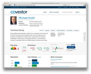
Clear numbers. We’ve added lots of new metrics for the data hounds out there – everything from alpha to sortino ratio, but also added a few simple measures we believe will help you pick the right model for you. For example, we clearly highlight the best and worst 30 days the model has experienced, which will hopefully provide a really clear indication of risk.
Visual data. To make our numbers even clearer, we’ve quadrupled the size of the performance graph, provided a month-to-month comparison to the S&P 500, and introduced a risk gauge. This should help you focus on finding the model for you, rather than deciphering data.
Powerful search. We’ve attracted some exceptional investment talent to Covestor over the last few years, and are introducing more models every quarter. This makes it even more important to help our clients find the right model for them, which is why our investment team has worked hard to categorize and tag every model based not just on their stated strategy, but also on what they’re actually doing. So whether you’re looking for high yield or BRIC focused models, now you can find them in one click.
We know these changes will make your experience far better than before, but this is just the first step. We have a lot more work to do during 2012 to make every step of your experience as positive and simple as it can possibly be. As ever, if you have any feedback or features you’d like to see, please let us know on our feedback page.
~ Martin


