

In past letters I have discussed the role of sentiment, economic factors and valuation in determining the size and scope of the current bubble in US financial markets.
This month we will dive directly into those areas that are most relevant to investors. We will look directly at stock prices and evaluate the implications for the bubble.
The major indices have made new highs in July. On the surface it looks like the good times are set to continue.
The S&P 500 is up 4.4% since first peaking in May. The Nasdaq, which consists largely of tech and growth companies, has made an additional 4.5% since peaking at the end of April. However, the Dow has been somewhat weaker, only gaining a tiny 0.2% since peaking in May.
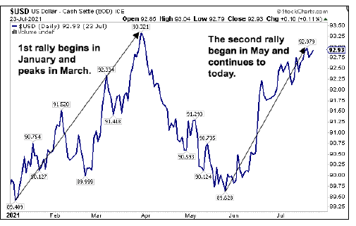
Of particular interest for large, sophisticated investors, the US dollar and treasury bond markets have been strongly rallying in the past couple of months. These assets serve as safe havens for capital when volatility and losses become paramount.

The leading sectors tell us how the hot money crowd is doing. Since January, the leading sectors have been falling one by one. Lastly, we take a look at the internals of market strength to gauge whether we can expect continued strength in the stock market.
Safe Assets
A move into safe haven assets such as the US dollar and US treasury bonds precedes most downturns in the market. Since January 6th when the US dollar made its most recent low, the dollar has made two strong attempts at rallying. The first attempt peaked as the tech sector was making a short-term bottom.
The second attempt, currently underway, has the added benefit of getting strong support from a rallying bond market. This second rally in the US dollar begins in May just as the Treasury market begins a rapid push upward.
The combination of both safe havens moving strongly together argue that sophisticated investors are now more interested in safety. As we see an increasing expect the rush to safety to increase. For example, China’s tech sector has been under pressure for months.
Serving as a backdrop to this rally for safety, the economy’s growth is slowing without additional stimulus to propel it forward. In the coming weeks, most, if not all, of the pandemic unemployment benefits come to an end.
Earlier in the year we saw the hottest sectors in the stock market flame out after hitting record highs. The renewable- energy sector peaked in January. It’s since fallen 46% before staging a weak bounce. In February, the new company index peaked and went on to lose 37% before weakly rebounding.
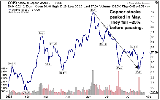
More recently, we are seeing the end of the inflation trade. The two commodities most closely associated with inflation are copper and oil. We can look at the performance of companies in these industries to get a handle on the direction of inflation.
The stocks of these companies tend to lead the commodities and thus show the direction in which inflation is heading. The copper miners peaked in May, well ahead of the peak in inflation fears headlines. Since then, they have fallen 25% before weakly rebounding.
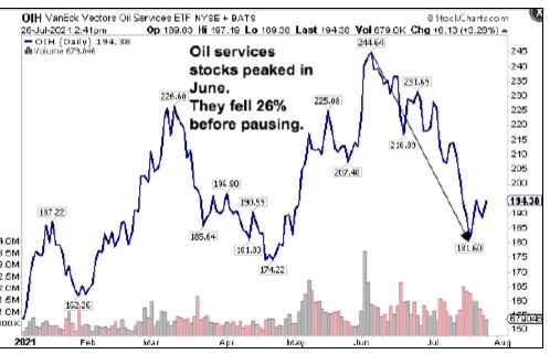
The oil services companies are probably the most sensitive to movements in the oil market.
Historically, the oil market tends to lag other markets in turning down. Once the oil market begins moving down, you can bet that a downturn is approaching.
When sector after leading sector begins to turn down, you can practically hear the sound of the dominoes falling. At this point, only the major indices quoted in the news, such as the Nasdaq and the S&P 500, are still going up. Next, we will take a look at what is going on under the covers that may tell a different story.
When we look under the covers, the market internals of strength and participation in the rally tell a different story. The Market internals of the Nasdaq and the S&P 500 give us a peek into the underlying weakness of the markets.
The Nasdaq consists largely of tech and growth companies. The S&P 500 represents the largest, most profitable companies in the stock market.
To get a sense of underlying weakness, we can look at measures of the breadth of the markets. The breadth of a market tells us the percentage of companies participating in the market rally.
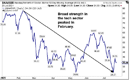
The first two charts measure the percentage of companies trading above their 50-day moving average. The 50-day moving average for a stock is used by traders to indicate how strongly a company is trading. Companies above the 50-day moving average are considered to be in a strong uptrend.

The Nasdaq chart shows that the percentage of companies above the 50-day moving average hit a high in February. They bottomed in May before bouncing up and have since revisited their weakness of May by going to a new low.
The chart for the S&P 500 peaked much later in the year. For the S&P 500, the percentage of stocks above the 50-day moving average peaked at 92.57% in April and declined to a low in June before pausing. In the 2008-09 bear market, this measure went as low as 1%.
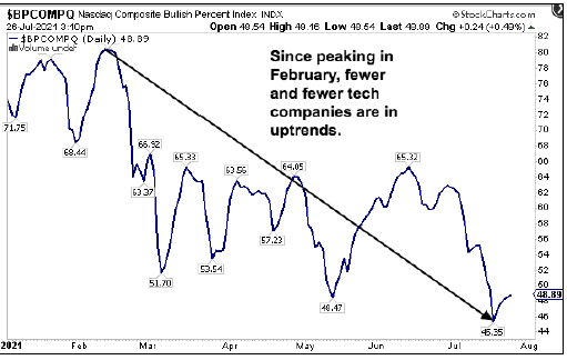
As the index that is most overvalued, the Nasdaq merits one more chart. This next chart measures the percentage of companies in bullish, up trends in the Nasdaq. Once again, this chart shows a peak in February. In July it hit a low for the year of 45.35%. During the 2008-09 bear market this measure reached a low of 6%.
Now contrast these charts with the fact that each of these indices have hit fresh all-time highs in July. The discrepancy between the internals of the stock market and the price level of the indices implies that not all is well.
China Syndrome
Up until February, the Chinese tech sector and the Nasdaq moved together hand in hand. Since then, the Chinese tech sector has lost a stunning 51% of its value and is now approaching the lows of March last year.
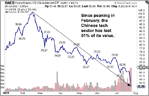
The question for investors is whether this downturn is an isolated event due to factors specific to China or whether this is the beginning of a broader downturn in financial markets.
Part of the benefit of globalization is easy access to markets across the world for goods and services. One downside is that financial markets have now become tightly coupled. It is difficult to say whether the US financial market can remain truly isolated from events in China.
Photo Credit: Ali T via Flickr Creative Commons
Disclosure
This publication may contain forward-looking assessments, which are based upon a number of assumptions concerning future conditions that ultimately may prove to be inaccurate. Such forward-looking assessments are subject to risks and uncertainties and may be affected by various factors that may cause actual results to differ materially.
The Standard and Poor’s 500, or simply the S&P 500, is a stock market index that tracks 500 large companies listed on stock exchanges in the United States. The Dow Jones Industrial Average, Dow Jones, or simply the Dow, is a price-weighted measurement stock market index of 30 prominent companies listed on stock exchanges in the United States. The Nasdaq Composite is a stock market index that includes almost all stocks listed on the Nasdaq stock exchange. Investors can’t invest directly into indexes.
This letter is provided as educational information only and is not intended to provide investment or other advice. This material is not to be construed as a recommendation or solicitation to buy or sell any security, financial product, instrument, or to participate in any particular trading strategy.

