by Michael Tarsala, CMT
Many large tech stocks and the Nasdaq still are looking strong fundamentally, according to Covestor Manager Libardo Lambrano.
He says that lots of quality tech companies — Microsoft (MSFT), Dell (DELL), Oracle (ORCL) Hewlett-Packard (HPQ), Intel (INTC), Qualcomm (QCOM) and IBM among them — could benefit from a wave of corporate software and hardware upgrades.
Most of them have strong balance sheets and high cash levels as well, he adds, to the point where some are being criticized for having too much cash.
Still, a strong uptrend for tech stocks that looked nearly unstoppable several weeks ago has looked more vulnerable in recent days with many tech stocks giving back some gains. Apple (AAPL) shares have helped to set the tone, sliding 5% in the first three days of trading the week of Sept. 24, as the company sold fewer iPhone 5s than anticipated amid a supply shortfall.
It’s raised some questions as to whether the strong tech stock rally since June can continue. Some notable analysts have grown more negative. Strategist Richard Suttmeier suggested this week that it’s time to book profits on tech stocks — just weeks after the group set multi-year highs.
When weighing expert market opinions, I often turn to charts as an additional source of information.
You may think that price charting is hocus-pocus, or a process that is only helpful to short-term traders.
I disagree. So does Bill DeShurko of 401 Advisor, a Covestor model manager who uses charts as part of his decision-making process and to help gauge the direction of overall trends for his low volatility, income-focused investment model.
Four years ago, DeShurko won the Charles H. Dow Award, the most prestigious in the field of technical analysis, for his research creating a diversified index-based low cost investment strategy utilizing price data.
“You can’t tell me that timing doesn’t matter,” DeShurko says. “Even if I buy something under the assumption I am going to buy and hold it nearly forever, I still look at technicals to time the purchase point, as well as the exit.”
The price analysis cannot provide a conclusive answer to what might happen next, of course.
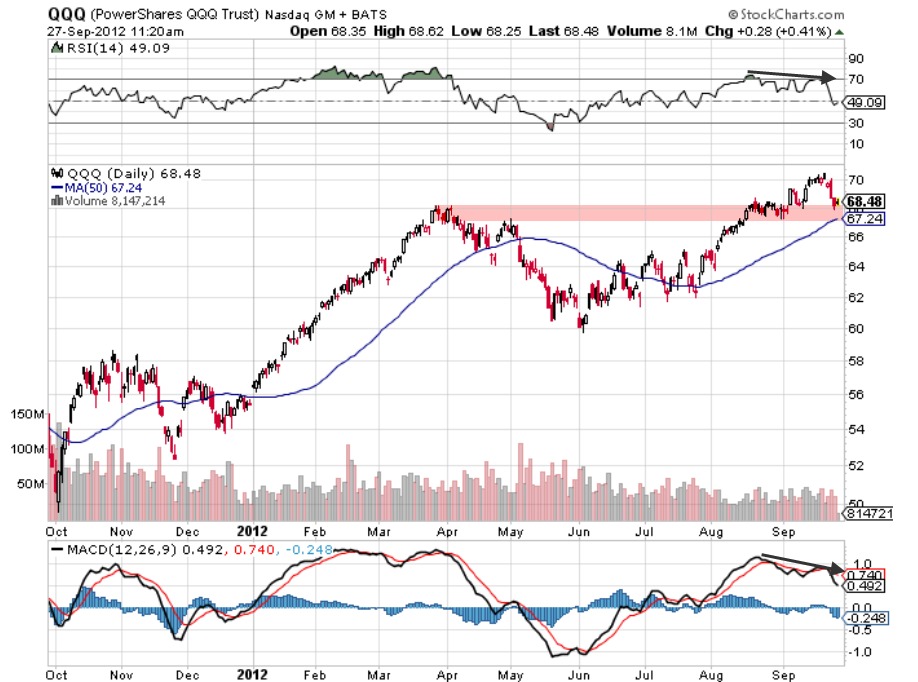
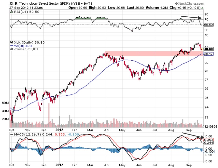
But here are the two key charts that I think will help you gauge the overall health of the sector’s price trend as we near the start of the fourth quarter:

Above is the tech-heavy PowerShares QQQ Trust ETF, better known as the Qs (QQQ). The strong uptrend from the June lows has not been undone by the recent selling.
Yet the RSI, a measure of underlying trend strength shown at the top of the chart, has been declining since mid-August. The weakening uptrend suggests the QQQs could test the price area marked by the April and May highs, the September lows, as well as the 50-day moving average.
That key price area, near $67.50, is a line in the sand being watched by analysts including the venerable JC Parets. He recently suggested that the price level needs to hold to keep the rally intact.

It’s a similar situation for the Technology Select Sector SPDR (XLK). The RSI is declining. The 50-day corresponds with the support range as well. Extending Parets’ logic to the XLK, it generally would need to hold around the $30 area, marked in pink on the chart, in order to keep its uptrend going.
I, for one, am keeping an eye on both charts as part of my own research.
Should the price levels on those two important chats hold in the coming weeks, my take is that it would help to confirm the bullishness in tech stocks, and possibly help to set the stage for further tech sector gains as we approach year’s end.
The investments discussed are held in client accounts as of September 28, 2012. These investments may or may not be currently held in client accounts. The reader should not assume that any investments identified were or will be profitable or that any investment recommendations or that investment decisions we make in the future will be profitable.


