by Michael Tarsala CMT
U.S. stocks stack up well vs. the rest of the world based on valuation, even as the price charts hint at the possibility of coming U.S. outperformance.
As of last week, the S&P 500 (SPX) was trading 14.9 times reported earnings, its biggest discount versus the MSCI World Index since March 2010, according to Bloomberg News.
One reason the U.S. valuation looks relatively strong is that the rest of the world’s stocks have outperformed the U.S. rally in recent months, thus becoming more expensive. Most of that outperformance is coming from Europe, where stock markets have been pricing in far less fear of a euro currency collapse.

Source: Stockcharts.com
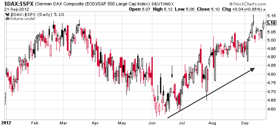
Above is a chart of Germany’s DAX Composite shown relative to the S&P 500. What is shows is that the DAX has outperformed since early June. That is despite the strong S&P 500 rally over that same timeframe.

Source: Stockcharts.com
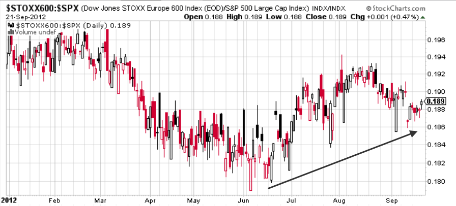
The same can be said for the Dow Jones STOXX Europe 600, a broad index of equities in the euro zone. It also has outperformed the S&P 500 since early June, although to a lesser degree. It began to lag again in late August.
There are still many reasons to like U.S. stocks, though, including underlying earnings strength, said Richard Bernstein, CEO of Richard Bernstein Advisor, in a CNBC interview. He said that earnings growth for companies outside the U.S. are “abysmal”.
The U.S. economy, for all its problems, is still hanging in there. GDP growth in the U.S. remains positive amid the global growth worries. The services sector is still growing. The housing market continues to show signs of strength. And while the jobs market is not improving quickly, there are few signs that it is rapidly declining from here.
Is it possible that relatively weak U.S. stocks will begin to lead the world again?

Source: Stockcharts.com
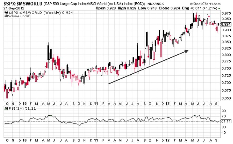
The chart above may help to provide cues. It tracks the performance of the S&P relative to the MSCI World Index. The S&P 500 has been an outperformer since late 2010, yet has lagged the rest of the world since July.
The black line at the bottom of the chart is the relative strength index, a measure of the price trend’s underlying power and momentum. Since early 2011, the RSI has never fallen significantly below the neutral point, at 50. It’s early, but it appears to have tested and held that line yet again in recent weeks.
The chart bears watching in the coming weeks. Should the relative strength index continue to turn higher from here, it could be interpreted as a positive sign that the global underperformance of the S&P 500 in recent months will be short lived, and that the S&P could begin to lead global stocks again.


