by Michael Tarsala, CMT
Market volatility has dropped big time. Unfortunately, that’s a bad sign for future stock gains.
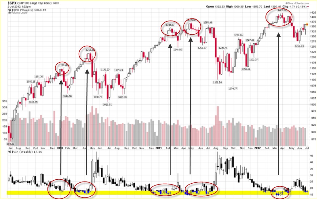
Here’s a chart from the VIX and More blog that shows you exactly what I mean.

Source: Vix and More
Think of volatility as fuel for a fire. As the chart shows, we’ve had three big stock rallies in the past three years. And each one has been a process of the market burning off volatility. As the VIX at the bottom of the chart drops, stocks rise.
But what happens when market the VIX gets all the way down to the yellow zone — that 15 to 18 level marked on the chart?
S&P 500 soon peter out. And the market becomes susceptible to increased volatility and more declines.
Take a look at what’s happening right now at the right edge of the chart. The VIX is now approaching the “yellow zone” again — a potential sign of caution.
Here’s one more chart of interest:
Stick with me on this one. At the suggestion of one of VIX and More’s loyal readers, I charted this:

Source: Stockcharts.com
The top of the chart is a very sensitive relative strength index or RSI. It’s used to help track extremes. When this sensitive RSI turns brown then begins to turn higher again, it tends to mark a bottom for volatility (the red and white bars on the chart), and a top for the S&P 500 (the black line).
It’s another VIX chart that’s flashing a caution signal.


