These maps just released from the Ecology and Agriculture Spatial Analysis Laboratory at Kansas State University and Farm Futures show the impact of this summer’s severe heat wave and drought on U.S. crops. They’re based on satellite data taken over a two-week period.
Here’s a comparison of this year’s vegetation to the 23-year average for this period (brown indicates ‘decreased biomass’ and green indicates ‘increased biomass):
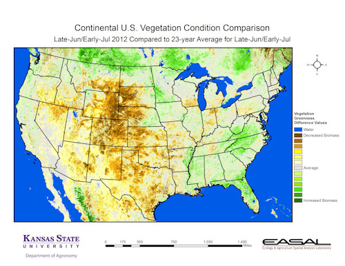
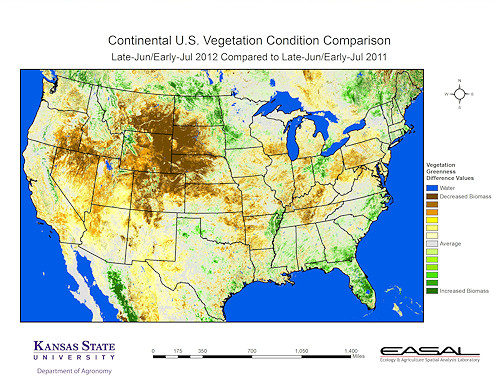
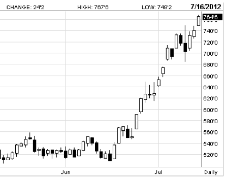
Nebraska, South Dakota and Kansas appear most hard-hit. This helps explain why corn and soy prices are soaring. Chart from the WSJ – click to enlarge:
The corn price surge since mid-June, via Joe Wiesenthal. This is for September ’12 corn futures:
Look how it’s impacted the Corn ETF (CORN) – three month chart:


