by Michael Tarsala
Update: Join us at the Free NextInvest online conference today. Don’t miss today’s live event at 1 p.m. ET, focused on Online Marketplaces & the Future of Finance. The panel discussion will include Albert Wenger of Union Square Ventures and Covestor CEO Asheesh Advani. You can also watch yesterday’s panel with 401 Advisor’s Bill DeShurko and many others.
Covestor model manager Bill DeShurko told me at the free NextInvest online conference that he doesn’t like what he sees right now in the market charts — particularly as it relates to riskier investments.
Ahead the seasonally weak “sell in May and go away” period, DeShurko at 401 Investor sees some technical indicators that are starting to look iffy.
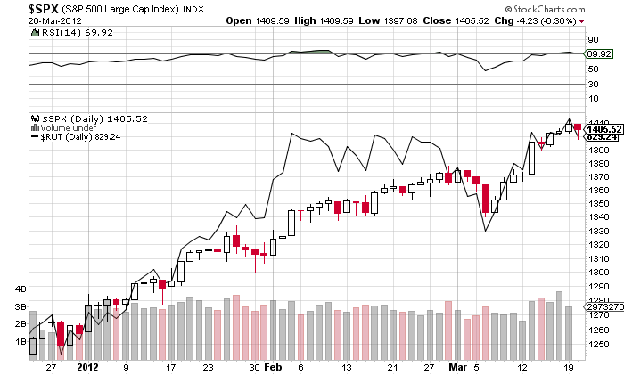
You’ll notice two things with the S&P chart below:
Source: StockCharts.com
First, the RSI indicator at the top of the chart is starting to roll over from a high level. It’s one indication that the stock uptend may be coming to an end. It’s not the be-all, end-all, as technicians know that oscillators can give false readings in strong uptrends.
More importantly, however, the chart shows that the Russell 2000, which is the dark solid line over top of the S&P candlesticks, is no longer the leader. You would expect the small-stock Russell to lead if an uptrend has plenty of gas left. Then when market rallies get long in the tooth, small stocks lag. As DeShurko points out, the Russell has been lagging for much of March.
But there’s more. See this one:
Source: Stockcharts.com
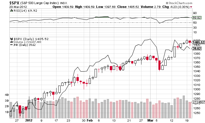
This one is the same S&P chart with the Barclays Capital High Yield ETF (the JNK) substituted in place of what was the Russell 2000. High yield, of course, is another risky asset class. What this shows is that JNK held its own in February. Yet it is now lagging again. It’s another potential sign of a mature rally.
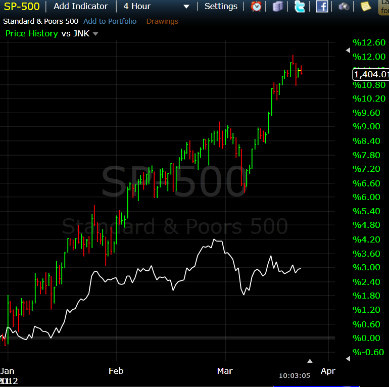
The chart below adds some important perspective. It shows the S&P and the JNK (JNK is the white line) in terms of their year-to-date percentage gains. You can see JNK has not kept pace this year.
Source: Freestockcharts.com
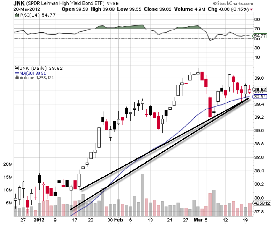
But here is the particular JNK chart that would prompt action:
Source: Stockcharts.com
The trendlines on the chart above correspond with the 30-day moving average, in blue. He says his trading system did not get faked out by move below the blue average line in early March. But a second breach of that line, he says, is possible. And that would meaningfully change his allocations.
His normal distribution is 75% dividend-paying stocks, 20% high yield through the JNK, and 5% cash.
DeShurko says another JNK move below its 30-day moving average, corresponding with those trendliens, will prompt him to move all of his JNK holding to cash.

