by Michael Tarsala, CMT
One measure of the stock market’s strength — the number of new highs — is petering out.

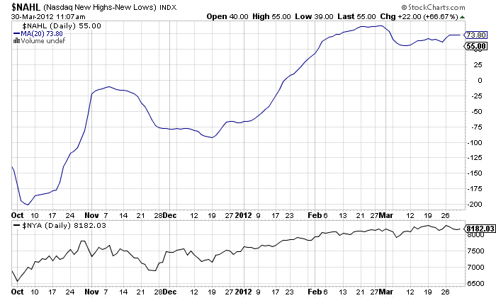
The blue line above shows the rolling number of new net 52 week highs on the Nasdaq (so the number of new highs, minus the number of new lows). To track the underlying trend, I charted this using a 20-day simple moving average.
What you see is the number of new highs starting to move sideways — not exactly a reflection of strength.
Chart the NYSE under the same parameters and it looks even worse.

Net new highs have been directional cues in the past. As you’ll see above (the NYSE price is the black line at the bottom) the trough in net new highs helped mark the October lows.
Then, you’ll also notice that the stabilization of net new highs in November and December provided a continuation signal.
I am not the only one to notice.
Here’s what JC Parets at All Star Charts had to say this week about the recent drop in net new highs (he noted this for the S&P 500):
The point is that the components of these averages take them higher or drag them lower. The less and less stocks making new highs, the more vulnerable the average. When new highs are made in the S&P500, you want to see an increased number of components making new highs as well. When you see less, the internals are weakening.


