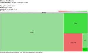
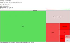
SymmetricInfo.org creates tools that help investors understand and visualize complex economic and financial concepts. They recently released a very helpful tool for visualizing ETF capital flows, which shows where money is flowing in and out of in the exchange traded fund (ETF) universe. Users can drill down to any level they want (sector, region) and see how flows have changed across different time scales.
For example, the following pictures depict the flows over the last month beginning at the top level and drilling down into commodities – click for full size:
If ETFs interest you, check out these Covestor models that employ ETF strategies:
- Broad ETF by Atlas Capital
- ETF Only by Capital Ideas
- ETF Review by ETF Review
- High Yielding Bond ETFs by Diddi Capital
- Opportunistic ETF by Harloff Capital
- Rebound ETF by Rebound Trading
- Top Ranked ProShares ETFs by Weisert Investment
Sources:
“ETF Money Flow Visualization Tool (beta)” Symmetric Info. http://symmetricinfo.org/charts-tools/etf-money-flow-visualization-tool/


