The future ain’t what it used to be–Yogi Berra
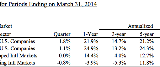
U.S. stocks represented by the Russell 3000 (RUA) earned 2.5% in the second quarter, bringing the year-to-date return up to a lofty 14%. By contrast, the MSCI EAFE index lost 1% in the quarter, bringing the year-to-date return down to 4%.
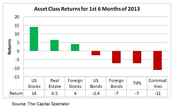
In fact, as shown in the following graph, no other asset class comes even close to the return on U.S. stocks so far this year. Hooray for U.S. stock investors. Will this dominance continue? Read on for my views. Bear in mind that U.S. stocks earned 16% last year, so the 18-month return through June is 32%.
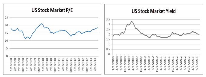
Traditional valuation measures – price/earnings ratio and dividend yield – provide no clue to over- or under-valuation because they are at the same levels they were five years ago, despite the runup in the market since then. Earnings and dividend payouts have increased in step with prices.
Source: PPCA Inc
In the following analysis, I examine the details of what worked in stocks around the world in the quarter and year-to-date, providing quick insights into market segments that have succeeded and failed. I also provide a forecast of what will work in the next quarter if momentum effects prevail. I conclude with a discussion of “June Jitters.”
U.S. Stocks
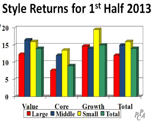
Small cap growth stocks led the way in the first half, earning more than 19%, according to the Surz Style Pure® classifications based on data from Compustat. By contrast, large cap core companies earned only 7.5%. Other than these extremes, style returns clustered around 14%. This has been one of those unusual periods where the “stuff in the middle” (core) has not performed in line with the “stuff on the ends.”
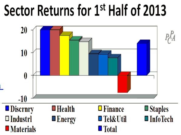
On the sector front, consumer discretionary and health care fared the best, earning 20%. By contrast, materials lost 7.5%.
But the interesting details lie in the cross-sections of styles with sectors, especially if we are interested in exploiting momentum effects. In Searching for Alpha in Heat Maps, published in early April, I showed how heat maps could be used for profit, and went out on a limb to forecast this quarter’s winners and losers, based on momentum in the heat map for the year ending March 31, 2013.
A heat map shows shades of green for “good,” which in this case is good performance relative to the total market. By contrast, shades of red are bad, indicating underperformance. Yellow is neutral.
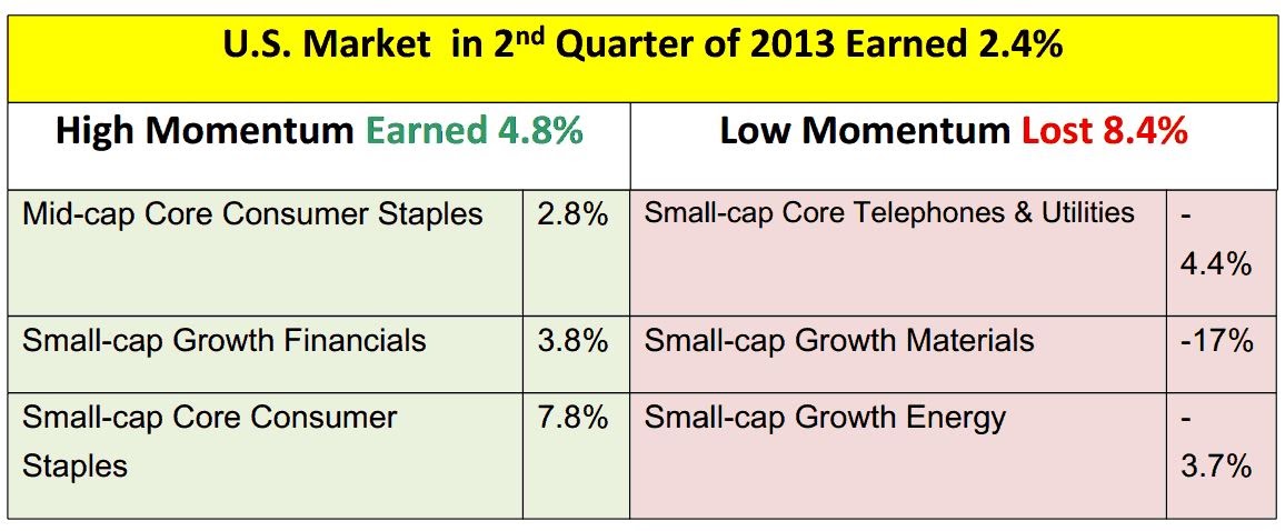
The following table shows the forecast I made in April (check me out) and the actual results. The “High” market segments were forecast to outperform the total market’s 2.4% return in the second quarter on average, investing equally in all 3 segments. The “Low” segments were forecast to perform less than the market.
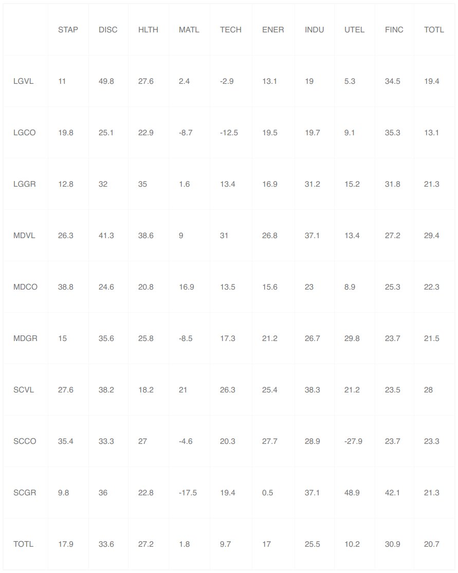
Now looking forward to the third quarter, the table below is the heat map for the year ending June 30, 2013. We see that the best performing market segment was comprised of large value companies in the consumer discretionary sector, earning 49.8%. The worst performing segment was small cap core in the utilities sector, losing 27.9%.
Many quantitative managers employ momentum in their models, buying the “green” and selling the “red.” Fundamental managers use heat maps as clues to segments of the market that are worth exploring, for both momentum and reversal potential.
US Heat Map for the Year Ending June 30, 2013
Source: PPCA Inc
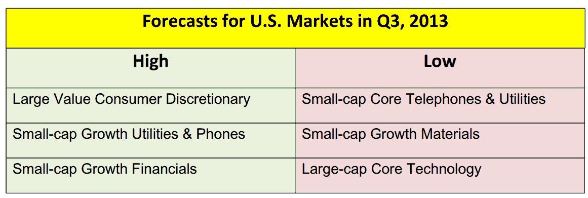
So I’ll go out on a limb again and attempt to forecast the following winners and losers for the next quarter. I’ll continue to track the results on a cumulative and quarterly basis. Let the games begin.
Foreign Stocks
Looking outside the US, foreign markets earned 2%, lagging both the U.S. stock market’s 14% return and EAFE’s 4.5% return. Japan has been the big story, earning 17.5% in $U.S. The return in Japanese yen was an even more impressive 34%. The Japanese stock market has soared in the first half as the yen was weakening against the dollar. By contrast, all countries outside Europe and Japan have suffered losses.
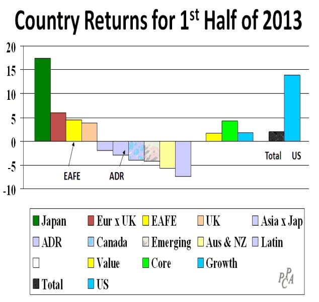
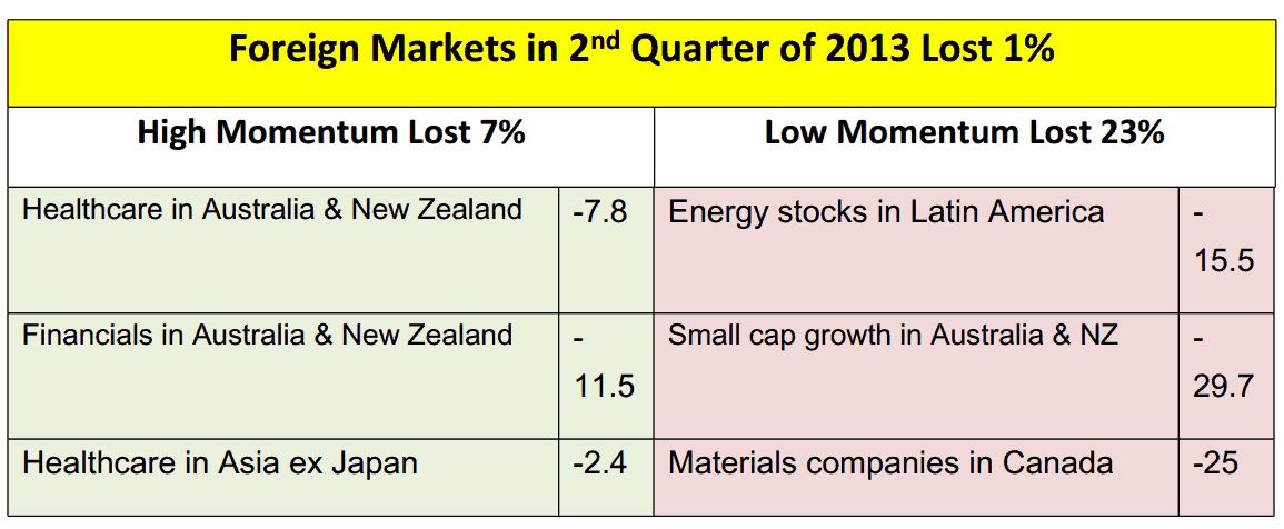
On the style front, core surprised, as it did in the U.S., but core led rather than lagged. Like the U.S., I had forecast winning and losing segments for this quarter. As shown in the following table, my foreign forecasts did not turn out as well as my U.S. forecasts.
The “Low” momentum underperformed as predicted, but so did the “High” momentum. A redeeming observation is that a long-short portfolio would have earned 16% (the difference between losing 7% and losing 23%). We’ll put this quarter in the semi-loss column for momentum investing.
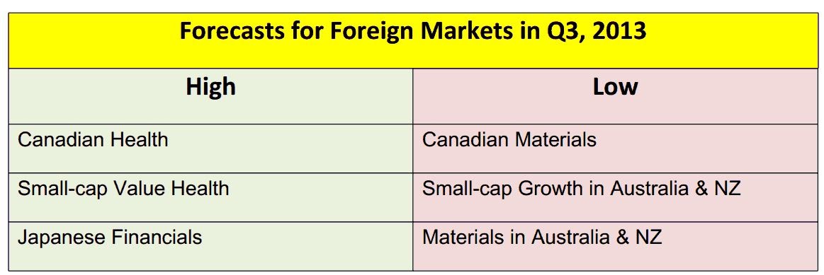
Now let’s turn to momentum effects leading into the 3rd quarter. The following table is a heat map for the year ending June 2013. As you can see, Health Care stocks in Canada have thrived with a 50.7% return, while Materials in Canada have lost 28.3%.
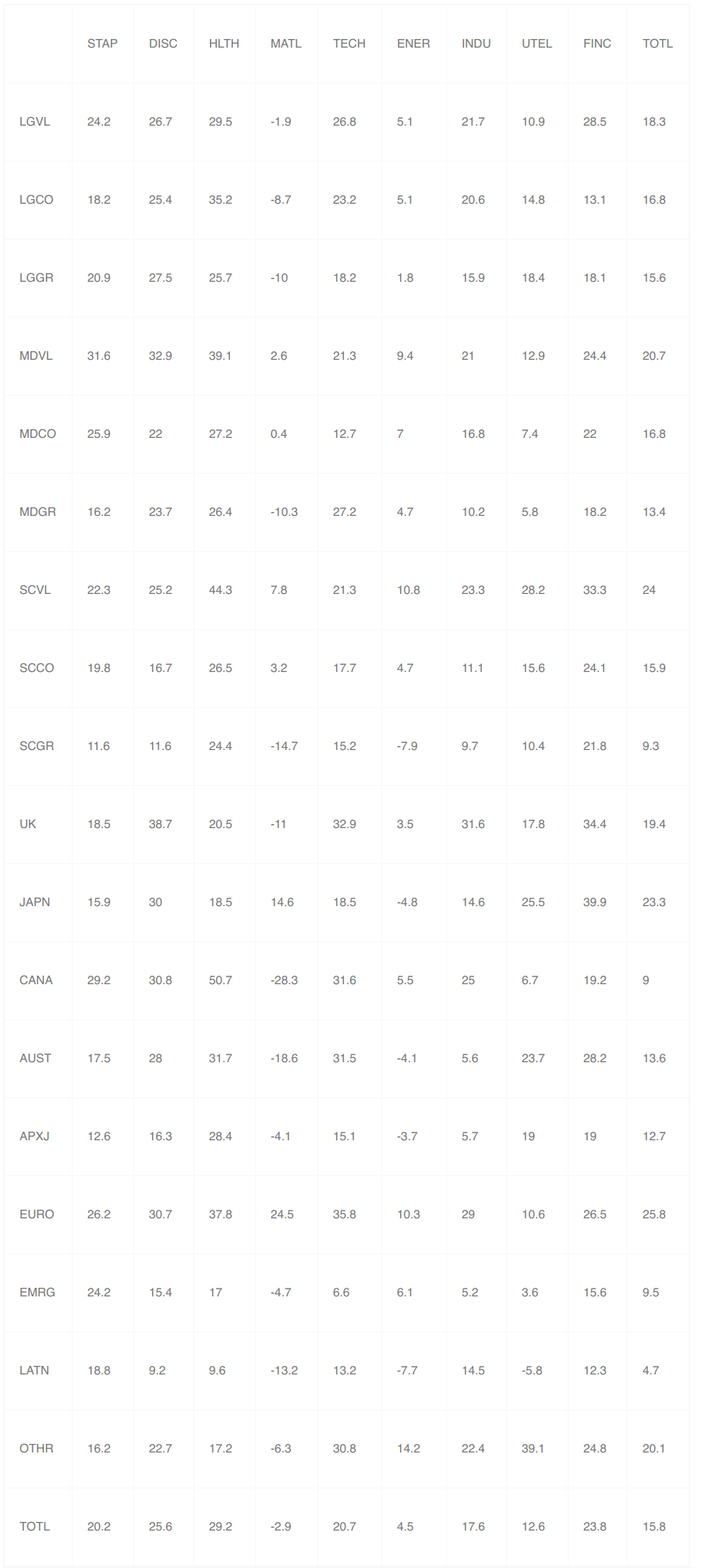
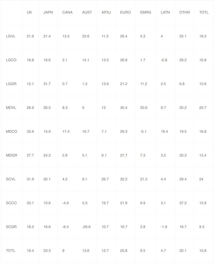
Accordingly, my forecasts for foreign market returns in the upcoming quarter are as follows:
How to Use This Information
So now you have outlooks for the next 3 months based on momentum effects, but momentum doesn’t always work. Specifically, reversals can and do happen, so you can choose to bet with or against me, but importantly I’ve given you some places to look for opportunities. Good luck.
But before you invest, keep the recent upsets in mind. June was not a good month for investors.
June Jitters
The first half of 2013 did not end well, with June losses in most asset classes, leading to concerns about what lies ahead. As shown in the following graph, June losses occurred across the board, with U.S. stocks hurt the least. Gold was brutally whacked.
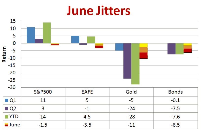
Fed Chairman Bernanke’s “tapering” comments are blamed for much of the declines. Quantitative easing can’t go on forever. It would appear that investors expect real interest rates to soar when the easing ends. This is one explanation for the precipitous decline in gold prices (as well as TIPS), indicating deflation fears, coupled with increases in bond yields. If yields increase while inflation decreases we will have increases in real (inflation-adjusted) yields.
I personally don’t think we will see large increases in the real interest rate on bonds, but we will see a return to positive real interest rates. We will also see serious increases in inflation. In other words, both inflation and real interest rates will increase. Accordingly, I see a long term recovery in gold but not bonds. What is Your Outlook?
Quantitative easing and the credit crisis have taken our attention away from the massive debt this country cannot afford, at least not in today’s dollars. Add the aging population demographic, and we’ve got serious headwinds for many U.S. companies.
June Jitters also launched a flurry of articles about target date fund safety, with most assuring that everything is OK, but it’s not. We still face the possibility of another 2008, or worse, but nothing has changed in TDFs to protect against this eventuality. Lemmings beware.
Investors appear to be distracted and confused. Blame hedge funds?
So What’s Next?
Quantitative Easing will end along with it its distorting effects. Markets will adjust to an unmanipulated reality: higher interest rates, inflation, and the pain of controlling our crazy spending, especially government spending. It won’t be easy, but it is inevitable. U.S. markets will not be the best place to be during the transition.
All opinions included in this material are as of July 22, 2013 and are subject to change. The opinions and views expressed herein are of the portfolio manager and may differ from other managers, or the firm as a whole. All investments involve risk (the amount of which may vary significantly) and investment recommendations will not always be profitable. Past performance does not guarantee future results.


