by Michael Tarsala, CMT
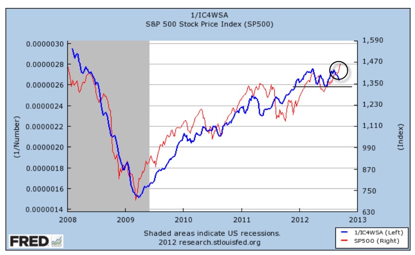
This just might be the most important stock market chart in the world:

Source: St. Louis Fed
It’s a look at initial jobless claims relative to the S&P 500. To be specific, the line in blue is the inverted four-week average of the jobless claims, an indicator watched by many on Wall Street, including Goldman’s rockstar executive and economist Jim O’Neill.
The blue line has been rising fairly steadily since March 2009, save for the dip in early 2011 that came ahead of a summer market sellofff. Yet it’s been moving roughly sideways for most of 2012 and in recent weeks has dipped lower. Because the initial claims line is inverted, the recent decline means that more people are filing for unemployment benefits recently.
There’s a reason that technical analysts, market strategists and money managers all pay attention to that blue line. It generally moves along with the stock market. More importantly, it tends to lead the market at key turning points.
Notice that it began turning higher at the end of the recession in 2001, months ahead of a similar move for the S&P 500. It topped out in 2006 and moved sideways for much of 2007 as the S&P continued to rally — a warning signal ahead of the financial crisis. Then it helped to confirm the market bottom in 2009.
Here’s a closer look at what’s going on with the chart right now:

Source: St. Louis Fed
The blue line has been falling in recent weeks — even though the red S&P 500 line continues to rise (circled in black). That is to say, initial claims are up, and so is the market.
Given the close correlation between these lines over time, it’s a divergence that might not last long. Either the blue inverted claims line would be expected to begin rising along with the S&P 500, or the S&P 500 would be expected to start falling with the blue line.
Here’s what that means in terms of headline numbers to watch:
The four-week initial claims average now stands at 377,750. Any number lower than that in the coming weeks would cause the blue line to rise again. That would help to confirm the S&P 500’s move higher. In particular, a claims average below this year’s low of 363,000 set in late March might be considered very encouraging for stocks.
It also could be viewed as a proxy as to whether QE3 is working.
The year high for the claims average is 387,500, set in mid-June. If the claims average were to rise above that level, the blue line would fall below the support in black marked on the chart.
Initial claims at that point could become a more significant drag on the stock market, and it might also be viewed as a sign that QE3 is failing.


