Covestor model: Select Equity
The recent market weakness has focused my attention on the protective stops we use in the Select Equity model. Ever since my first trade, I’ve been interested in how one properly determines a stop loss level. After all, “cut your losers quick and let your winners run” was one of the mantras drilled into my head from other traders. I’ve tried using average true range (ATR) multiples, moving average convergences, and historical resistance levels. Regardless of method, I was never satisfied with the result. Too often I would watch a stock trade down to my stop loss level just to reverse to the upside and start a new leg higher.
For those of you who don’t know, I’m a system based trader. I have a system that tells me what to buy, when to buy, how much to buy, and when to sell. Using a trading system such as this allows me to collect and analyze data most discretionary traders probably don’t track. For example, since each trade in my system has a distinct holding period, I can monitor the price action for each stock and develop rules around establishing stop loss levels.
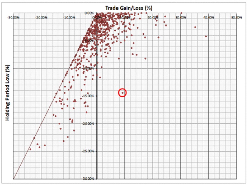
When it comes to determining stop loss levels, the most obvious metric to track is holding period low versus the trades resulting gain or loss. Below is a graph showing all the trades for my Select Equity Model from 2010 to date (597 trades in total) with the holding period low on the y-axis and the trades’ resulting gain or loss on the x-axis:
Data and chart: AlphaLab Capital
For an example on how to read this graph, take a look at the data point highlighted by the red circle. For that trade, the stock dropped -14.4% from the buy signal, then reversed +23.6% higher where the sell signal closed out the trade for a +9.2% gain. The other item to point out is the diagonal line extending from the origin to the lower left corner of the graph. Data points on that line simply represent trades that closed out on the lows for the holding period.
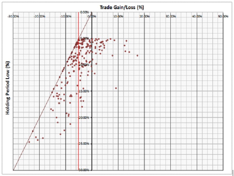
Okay, so we have all this data. Now, what to do with it? Let’s start by applying theoretical stop loss limits to the data and take a look at the results. First, let’s use a -5% stop loss limit. Filtering the data for a -5% stop loss limit gives the following results:
Data and chart: AlphaLab Capital
All of the data points with holding period lows above -5% were removed from the graph. Also, I’ve added a vertical red line that represents the -5% loss that would result if a -5% stop loss was used for each trade. All data points to the left of the vertical red line represent trades that would have sustained additional losses (i.e., the stop loss ‘worked’) whereas all data points to the right of the vertical red line represent trades that would have closed above the -5% stop loss level (i.e., the stop loss ‘didn’t work’).
Let me state here that I am using the term ‘didn’t work’ very loosely. Clearly, stop losses are designed to protect against additional downside. I’m simply stating that for the purpose of these results, there are several examples where the stop loss would have closed the trade too early. Looking at these results, using the stop loss would have resulted in a -5.0% loss for each trade whereas not using the stop loss would have resulted in an average loss of only -4.4%. Meaning, a 5% stop loss (although an excellent mental safety net) would have actually had a negative impact on the model results by an average of -0.6% per trade.
Some may think a -5% stop loss is too tight. Okay, what about using a stop loss of -10%?
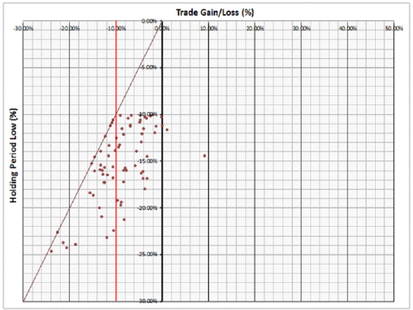
Applying a theoretical stop loss limit of -10% produces the following graph:
Data and chart: AlphaLab Capital
Once again, all of the data points with a holding period low above -10% were removed from the graph. The vertical red line was also adjusted to represent the -10% stop loss. As was the case for the -5% stop loss, there are several trades on each side of the vertical red line. In this case, using the stop loss would have resulted in a -10.0% loss for each trade whereas not using the stop loss would have resulted in an average loss of only -9.0%. So, a -10% stop loss would have actually had a larger negative impact on the model results compared to a -5% stop loss (by an average of -1.0% per trade).
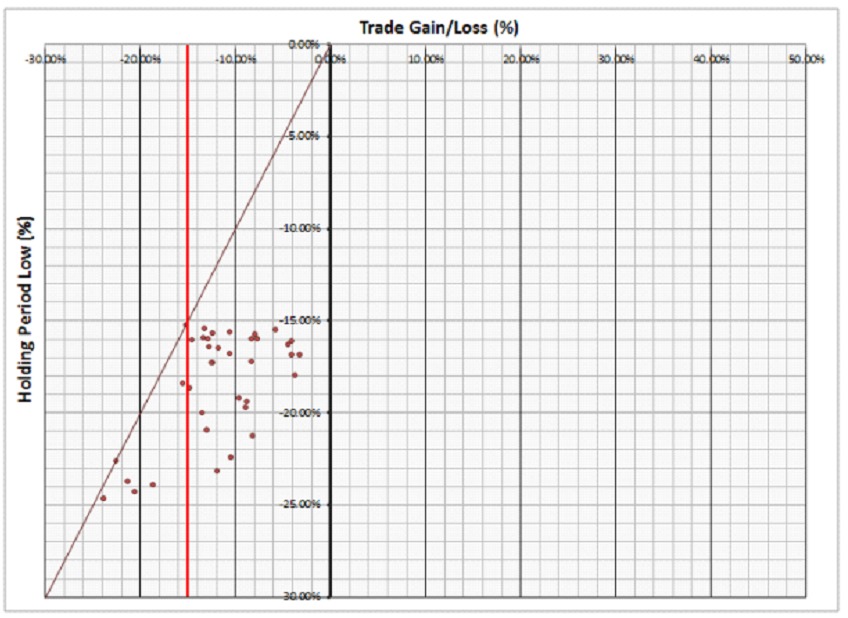
What about using a stop loss of -15%? Applying a theoretical stop loss limit of -15% produces the following graph:
Data and chart: AlphaLab Capital
Once again, all of the data points with a holding period low above -15% were removed from the graph. The vertical red line was also adjusted to represent the -15% stop loss. For this example, it can be seen that there are more data points to the right of the vertical red line than not. Meaning, most of the stocks that dropped -15% from the buy signal ended up reversing and closing higher at the sell signal. In this case, using the stop loss would have resulted in a -15.0% loss for each trade whereas not using the stop loss would have resulted in an average loss of only -11.7%. So, once again, a -15% stop loss would have actually had a larger negative impact on the model results compared to a -5% or -10% stop loss limit (by an average of -3.3% per trade).
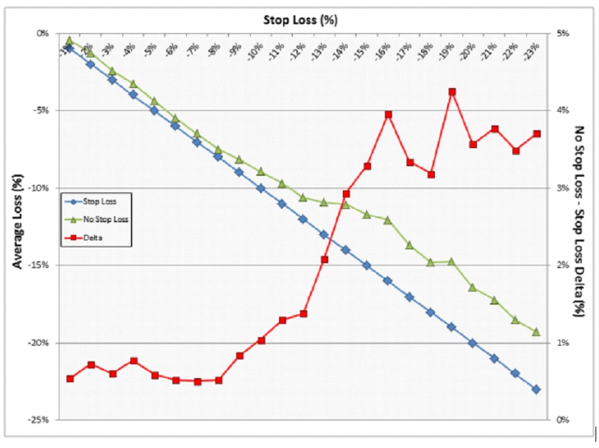
Compiling the data for any whole number stop loss limit provides the following graph:
Data and chart: AlphaLab Capital
This graph shows the performance spread between using a stop loss limit and letting the trades unfold without stop loss limits. Most interesting is the red line, which represents the delta between the two methodologies. The data shows that letting the trades unfold without stop losses actually outperforms any system that employs stop loss limits (i.e., all the red data points are above 0%). Also, the spread in the performance actually increases as one loosens the theoretical stop loss limit (i.e., the more a stock drops from the buy signal, the more likely it is to reverse and close above the stop loss limit).
That second point is counterintuitive and difficult to accept. When I’m watching one of my stocks go down -10% or -20%, the last thing I’m thinking about is how likely it is to reverse higher. That said, I’ve seen far too many examples of my -12% or -15% stops being taken out, just for the stock to shoot higher (which is consistent with these results).
I find it interesting that this data supports the mantra of cutting your losers quick and letting your winners run. In this case, cutting your losers quick (by using a tight stop loss) has the lowest impact on the model’s trading results. As a result of this work, I now employ an -8% stop loss on most of my positions. I feel as though that gives enough room for the trade to work while protecting the downside. That’s the whole point, isn’t it?


