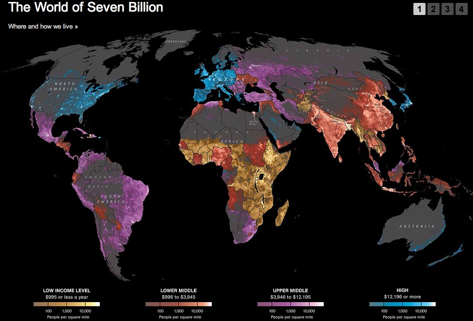
Here’s an amazing new infographic from National Geographic that maps income levels on top of world population densities. In a glance you can see where humans live on earth and at what wealth level. Click through for the full thing, plus more demographic information (on pages 2-4) broken down by income level:

Source: “The World of Seven Billion” NationalGeographic.com, retrieved 6/29/11, http://ngm.nationalgeographic.com/2011/03/age-of-man/map-interactive


