 Following the turmoil in the middle east, Japanese earthquake and renewed worries over European debt, gold has resumed its seemingly inexorable march higher. Metals industry resource Kitco reports:
Comex gold futures on Wednesday closed higher and set another new all-time record high of $1,467.00 an ounce, basis the active June futures contract. Meantime, Comex silver futures hit another fresh 31-year high as prices close in on $40.00 an ounce. The precious metals are seeing strong investment demand coming from several fronts. There are no early warning signals to suggest gold or silver prices are close to market tops. Comex June gold last traded up $6.60 an ounce at $1,459.20. Spot gold last traded up $1.50 at $1,459.00.
The fact gold is scoring new all-time highs on a regular basis, while silver is at a three decade high is garnering more general media attention to those metals, which in turn is attracting more investment demand to them. Don’t be surprised to see bigger daily price moves in gold and silver–both on the upside and on the downside, in the near term. Gold market bulls are now targeting psychological resistance at $1,500.00 an ounce as their next upside price objective, while silver bulls are close to pushing prices above major psychological resistance at $40.00 an ounce.
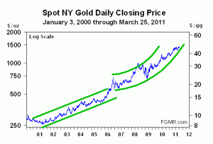
Additionally on Kitco, James Turk notes that Gold has entered into a hyperbolic rise:
The above chart has been prepared on a log scale so that, for example, the distance between $250 and $500 is equal to the distance between $750 and $1500. A chart prepared with an arithmetic scale does not accurately portray percent changes, while a log scale chart illustrates percentage changes perfectly, which is important. After all, if an asset you own doubles in price, it is this percentage gain that shows the relative increase in your wealth. In other words, if your asset doubles in price from $2 to $4, it is the same percentage gain as a double from $10 to $20, though obviously the absolute amounts may be different depending on the quantity of each asset you own.
From 2000 to about 2006, the gold price was confined within a linear uptrend channel, marked by the green parallel lines on the above chart. Thereafter, gold’s pattern changed to what looks like a parabola, but is actually a hyperbola because the above chart is prepared on a log scale.
This observation means that the gold price is rising at an accelerating rate, so there is in my view only one logical conclusion that can be made from this chart. Given that gold remains the world’s numéraire by which things are measured because it is money, the other so-called ‘money’ being measured in the above chart – namely, the US dollar – is losing purchasing power at an accelerating rate. In other words, we are rapidly approaching the hyperinflation of the US dollar. In fact, the above chart illustrates that it has already begun. The dollar’s hyperinflation will worsen if gold keeps climbing within the hyperbola on the above chart.
Covestor models that are long the SPDR Gold Trust ETF (NYSE: GLD) as of 4/6:
– CANSLIM from Peter Kurata
– Bottom-Up Analysis and Bottom-Up Analysis Agg from Epic Advisors
– Behavioral Global Macro from BFI Advisors
– Equity Opportunity from 401 Advisor
– Global Diversified Conservative and Global Diversified Aggressive from Oceanic Capital
And Management Access from Douglas Estadt is short GLD.
Sources:
“P.M. Kitco Metals Roundup: Comex Gold Scores Another New High as Inflation Concerns Heating Up” Jim Wyckoff. Kitco News, 4/6. http://www.kitco.com/reports/KitcoNews20110406JW_pm.html
“Gold’s Hyperbolic Trajectory” James Turk. Kitco, 3/28. Gold’s Hyperbolic Trajectory


