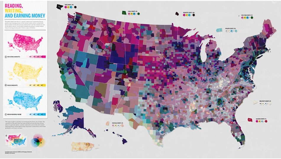
GOOD took recently released census data and created this map to show the link between education level and income – click through for larger version:

The color combinations tell the story, as Cliff Kuang of FastCo Design explains:
If a county is, say, orange… that’s a combination of yellow and pink but not blue — thus the residents there are often high-school and college grads, but they don’t make much money. But if an area is almost black, that means that it has a high percentage of high-school and college grads and the people make a lot of money… two colors you see a lot of are pinks and deep blues. Pink means that in this day and age, simply having a high school education often doesn’t lead to improved job prospects. The deep blue, meanwhile, shows how common it is for college graduates to be living where wages are high.


