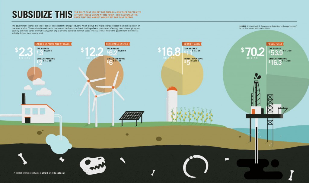
The good folks at GOOD have produced this graphic to show government subsidies for different energy sources:
The goal, as GOOD describes it, is to show how government policies “favor some types of energy over others, giving our country a skewed sense of what each gallon of gas or wind-powered electron costs.” But there are some problems with this presentation.
The infographic gives only a total dollar amount of subsidy. So Nathan Yau at FlowingData rightly asks, “how much of that difference is simply because there are more fossil fuel sources than the others?”
To take it one step further, the graphic would be much more helpful if it showed the amount of subsidy per unit of energy produced. And while GOOD claims that this shows that “the price that the market would set for that energy” is higher than it would be without this subsidy, there’s really no way to know that, of course. Maybe oil companies, for example, would choose to lower their profit margins in step with a lower subsidy – and the price they’d offer to the market would stay the same.
And this is aside from the important issue of the real cost of each energy source in terms of externalities – local pollution and anthropogenic global warming chief among them.


