Social media, repetitive media, high-frequency trading and more… Hedge Fund is betting that Twitter is Wall Street’s Crystal Ball – Robert Andrews, PaidContent.org Sharp rise in financial pros using social media for news – IR Web Report You are reading the same article over and over again – Joshua Brown, […]
Outlook
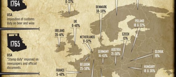
CreditLoan presents this fascinating infographic comparing both corporate and personal tax rates around the world. Now we wait for an infographic showing the mass migration from Denmark to Switzerland!
Zack Miller is Covestor’s Head of Business Development. In his podcast below, Zack speaks with Theresa Hamacher and Bob Pozen, authors of a new book on the mutual fund industry. Mutual funds have introduced millions of Americans to investing in the stock market. While their popularity and usage may have […]
Private Equity investor Chris Douvos has been watching a lot of Indiana Jones movies with his kid. In his current fave, The Last Crusade, Douvos finds in the three tests Indy has to pass to obtain the Holy Grail some essential lessons for investors: Challenge #1: The Breath of God… […]
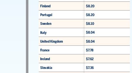
The folks at GOOD collected a sample of gas prices from throughout the industrialized Western world in this infographic: Here are some more countries, via the Gasoline-Germany site: Afghanistan: $8.04 Bolivia: $2.26 Brazil: $5.99 China: $4.47 Greenland: $7.14 Hong Kong: $7.67 India: $4.57 (for 91 octane, on July 14, 2010) […]
Om Malik has been covering the telecom beat with great insight for many years and isn’t afraid to speak his mind. In the wake of the huge AT&T (NYSE: T) acquisition of T-Mobile USA, Malik weighs in, saying “it’s hard to find winners, apart from AT&T and T-Mobile shareholders.” The […]
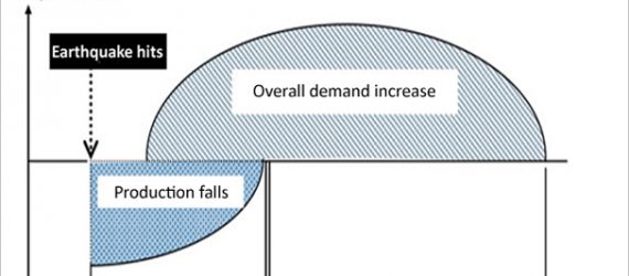
Clusterstock created this interesting chart from a Barclays report about the coming reconstruction boom in Japan, which concludes that short-term GDP declines will ultimately give way to faster GDP growth. (Click image for full size) What companies will profit from the reconstruction boom? According to Scott Rothbort of StockPickr, there […]
The New York Times created this infographic about exploiting the local grocery store’s salad bar for the most value (click for full size): Sources: “How to Beat the Salad Bar” Nate Silver. New York Times, 3/17/11. https://www.nytimes.com/2011/03/20/magazine/mag-20Subversion-t.html?_r=2
For those who may not be familiar, Footnoted is a website devoted to corporate SEC filings. Michelle Leder and her staff dig through filings for interesting disclosures amongst the corporate boilerplate. Today she posted about how corporations have been including the Japanese disaster in their filings. There have been 48 […]
In a prescient 1989 article entitled How a Tokyo Earthquake Could Devastate Wall Street and the World Economy, author Michael Lewis looked at historical earthquakes to project the economic impact of a (at the time) hypothetical massive Tokyo earthquake. It’s a bit hard to read in this scanned version from […]
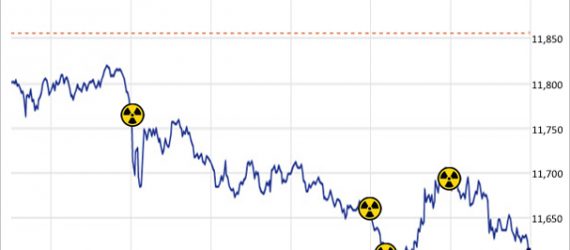
The Dow Jones Industrial Average (DIA) tracks 30 large well known American companies. Clusterstock released a chart showing how the Dow reacted Wednesday to nuclear headlines – details on each headline here: Source: “Chart of the Day: The Dow Makes Huge Swings on Every Fukushima Headline” Gregory White. Business Insider, 3/16/11. https://www.businessinsider.com/chart-of-the-day-dow-march-16-2011-3

